Claude Opus 5.5
Anthropic · Claude Code
// Design Challenge #001
An experimental magazine about technology and the internet, built in React, TypeScript and Tailwind: a cover, an index of six stories and one long read.
// The solutions
Final builds, as delivered.
Anthropic · Claude Code
DeepSeek · DeepSeek Harness
// Side by side
Same views, captured the same way for both.
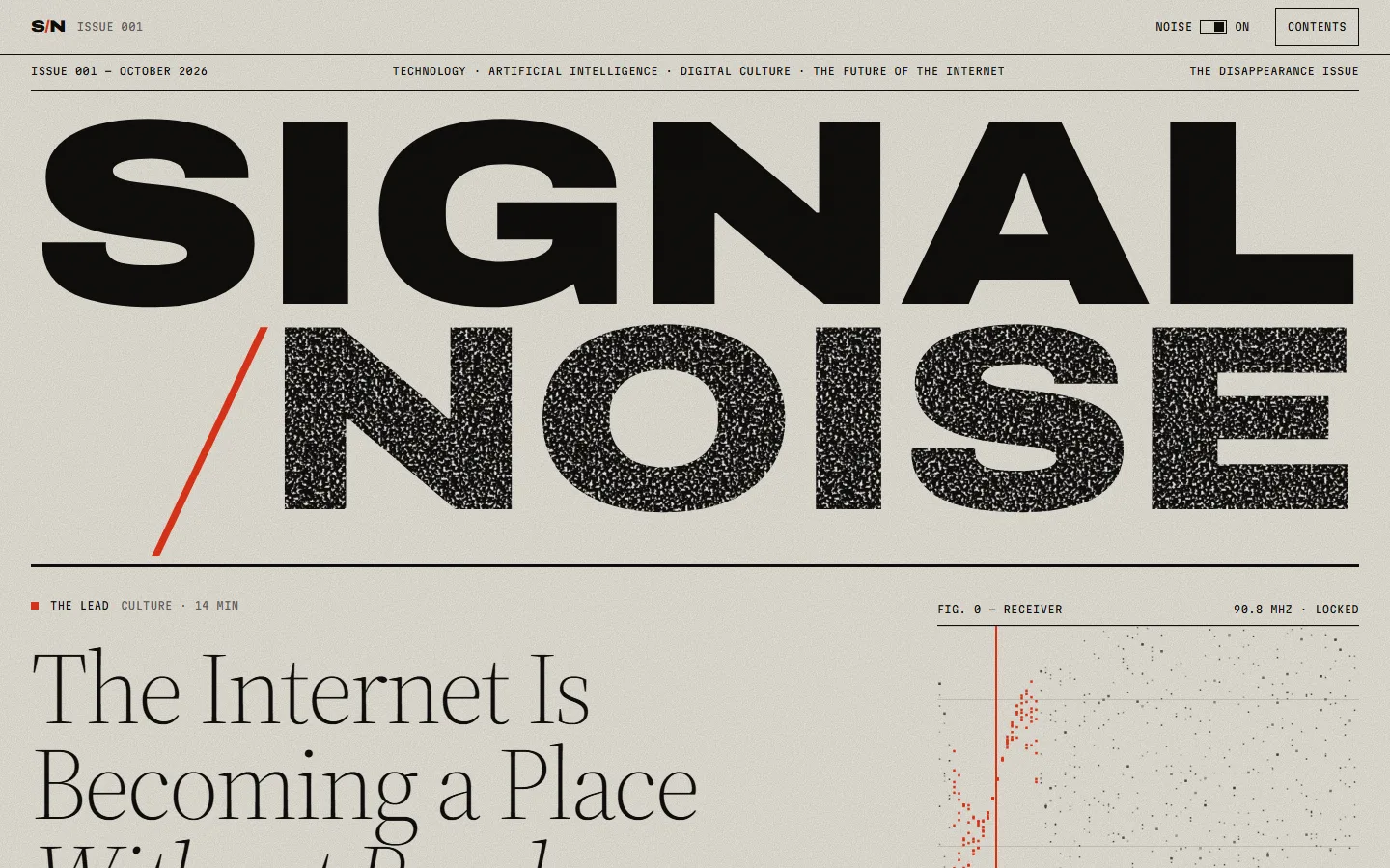
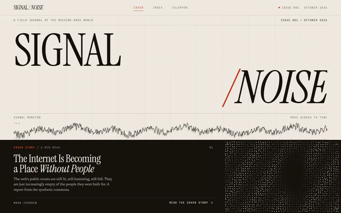
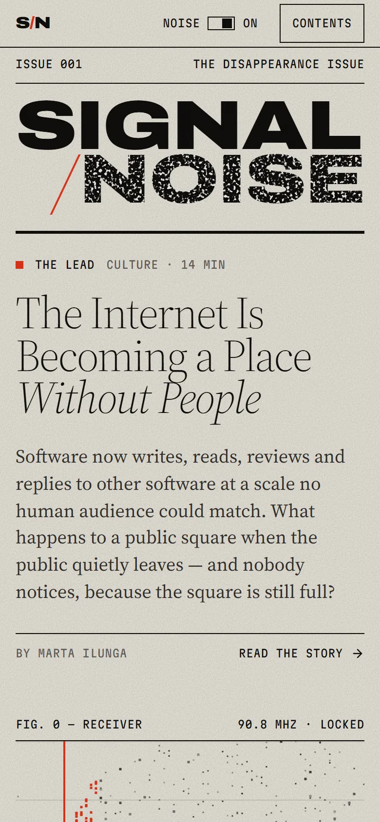
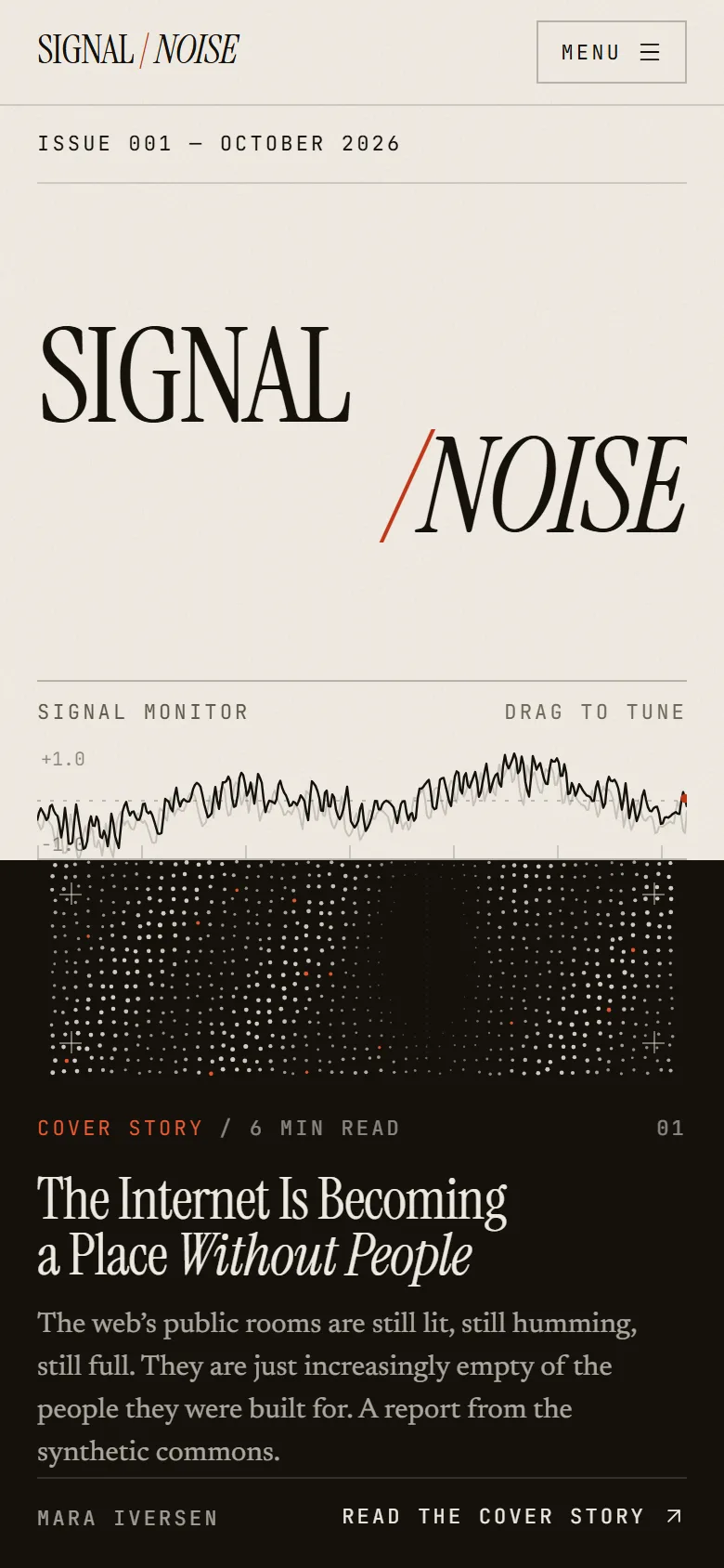
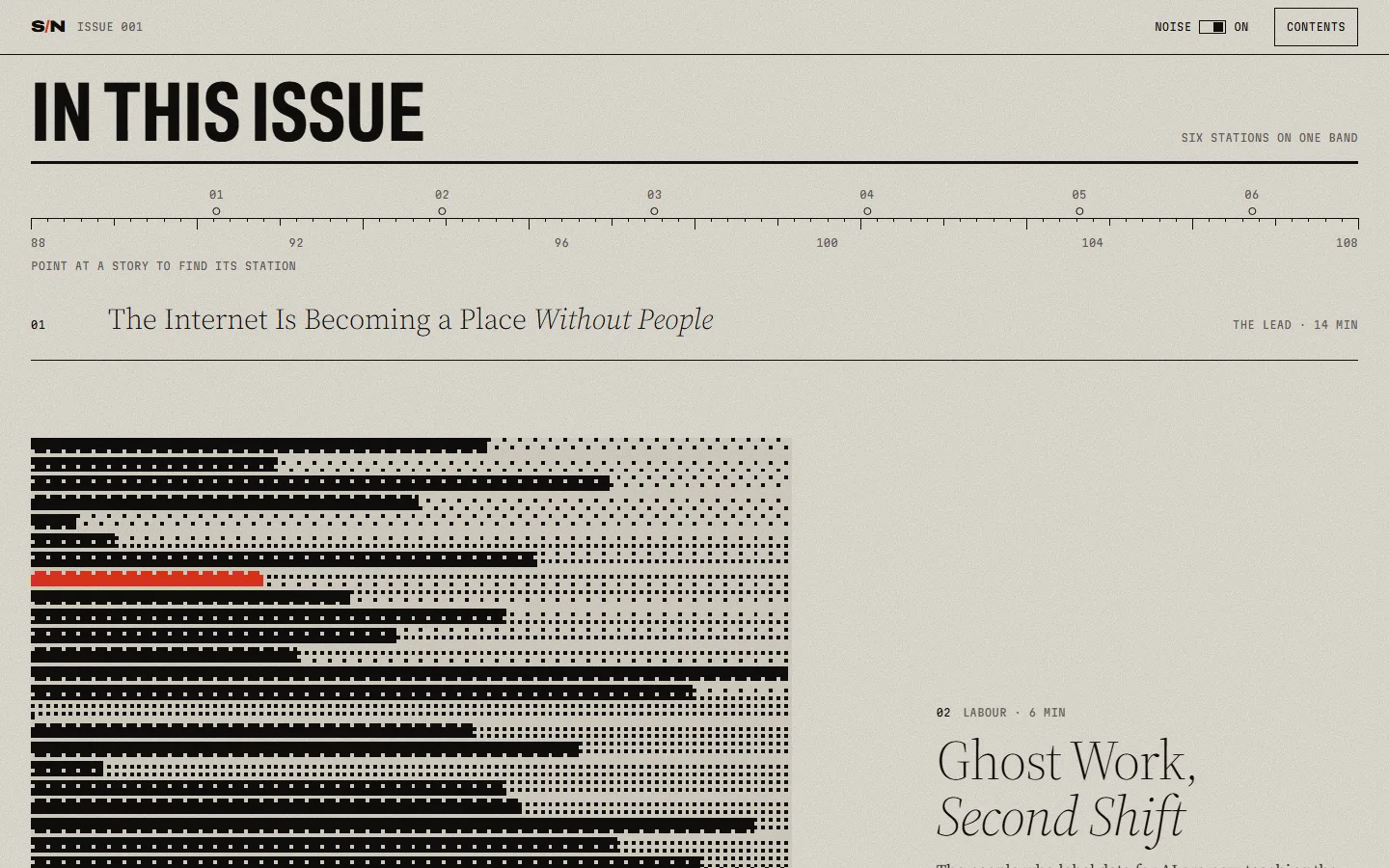
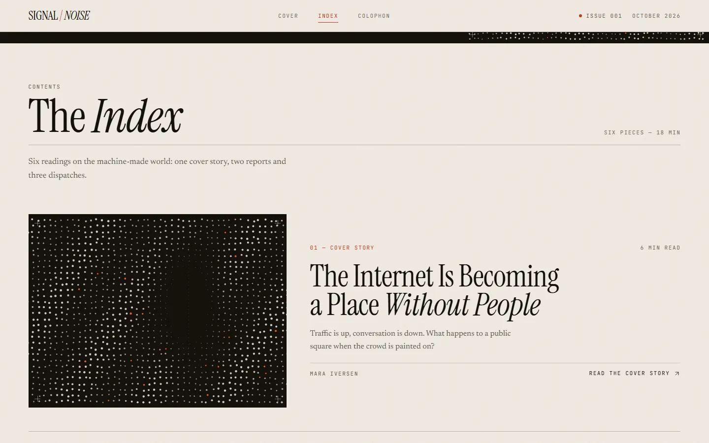
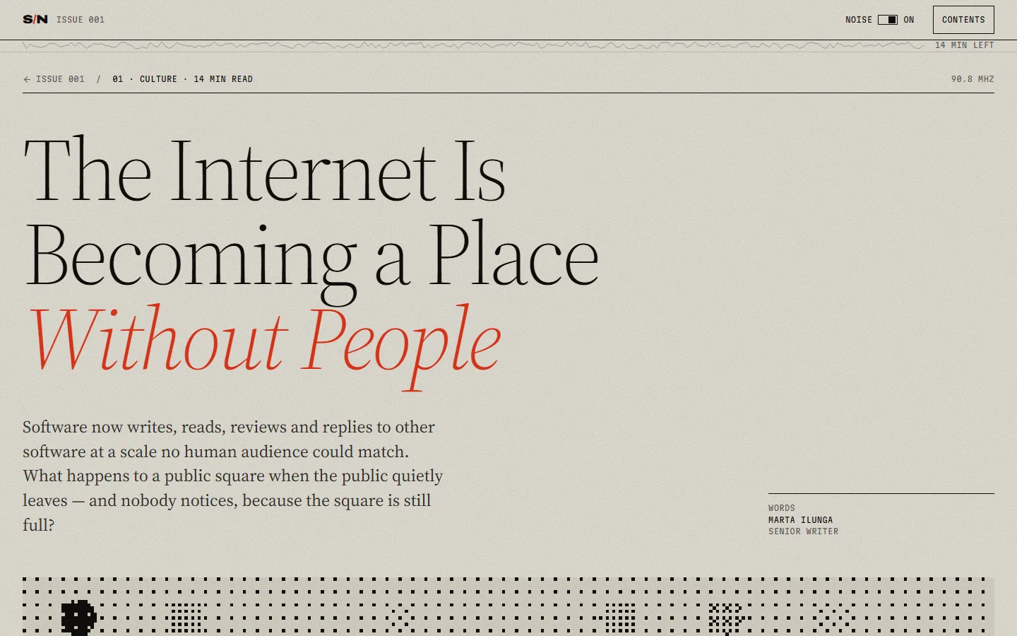
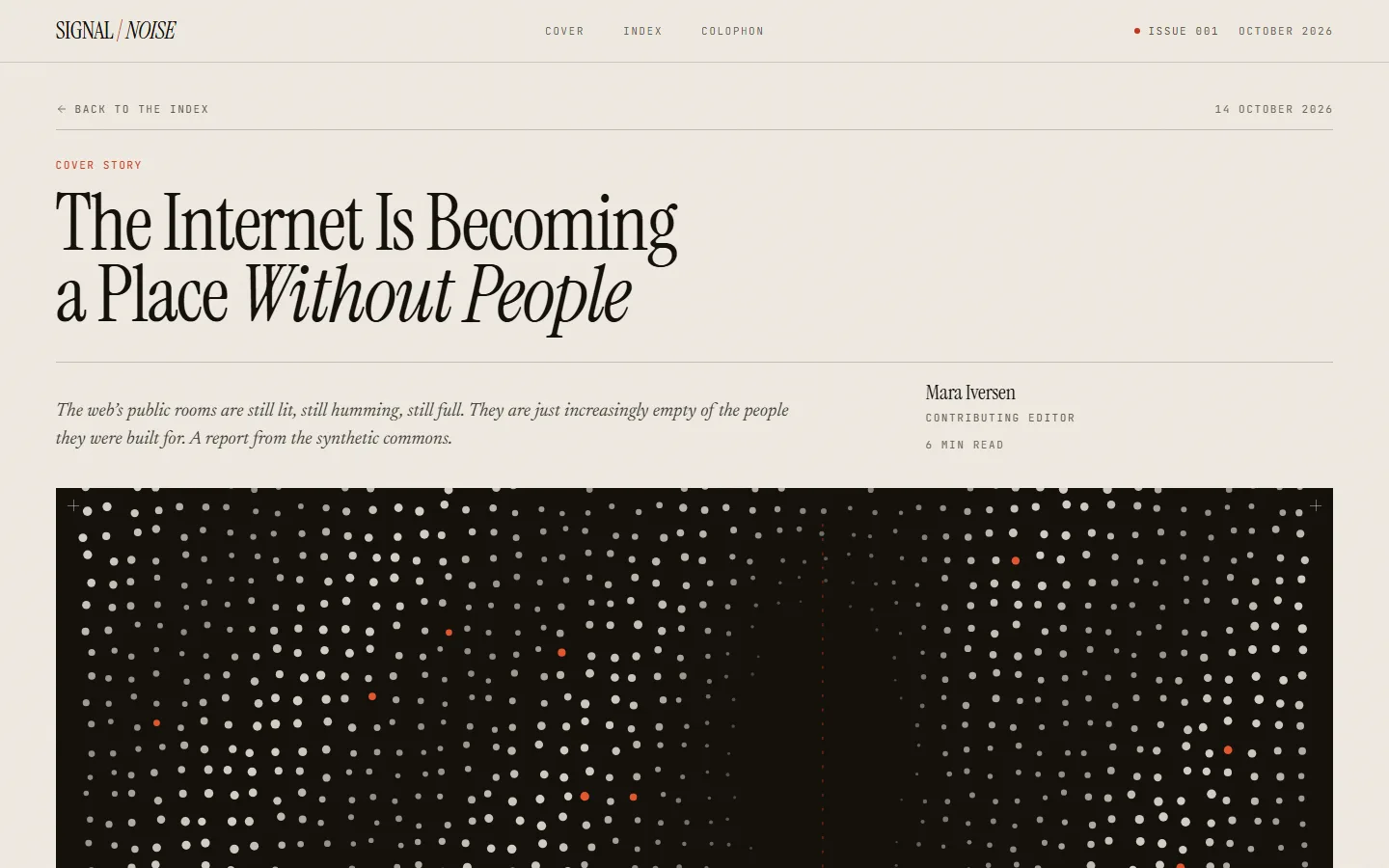
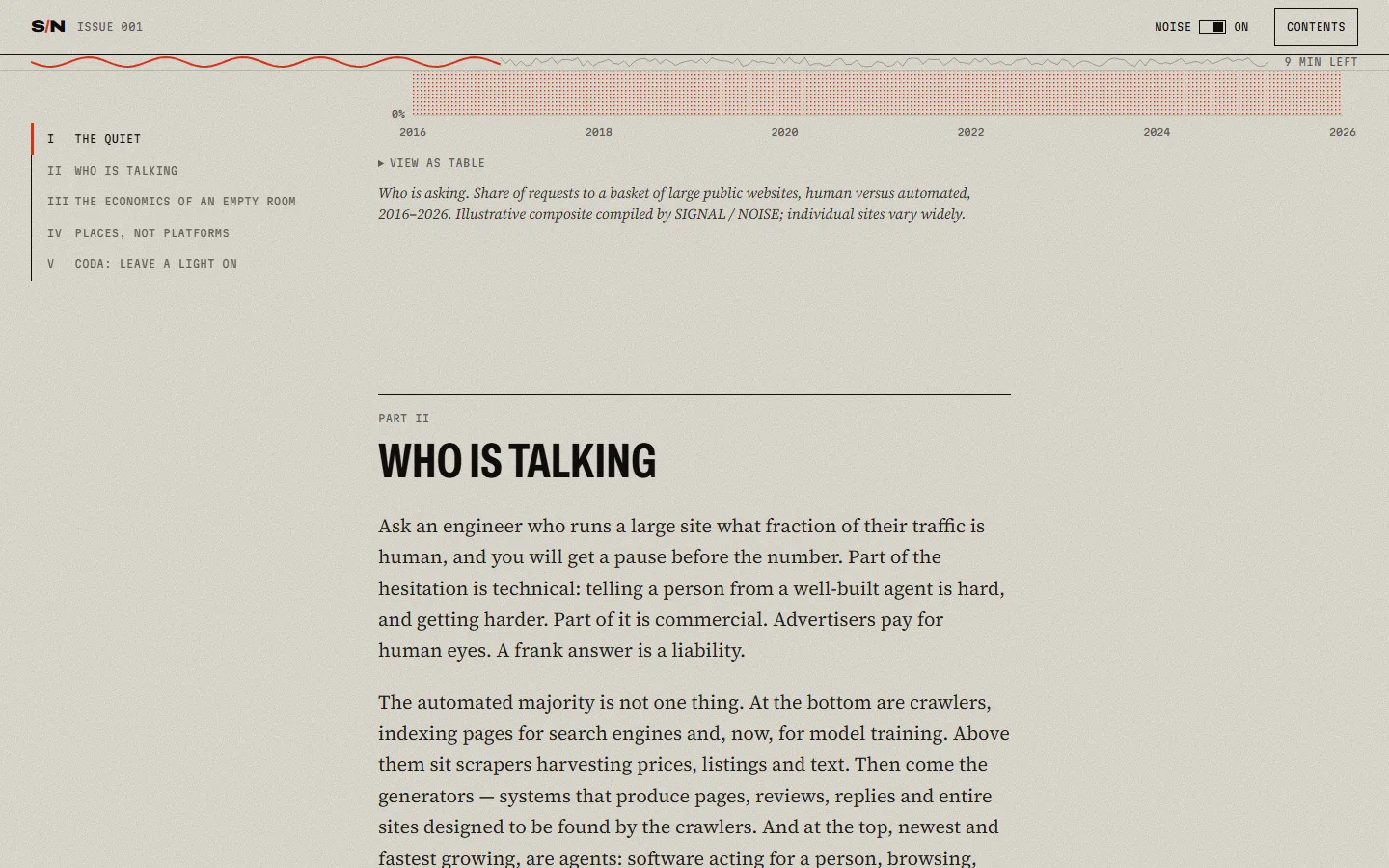
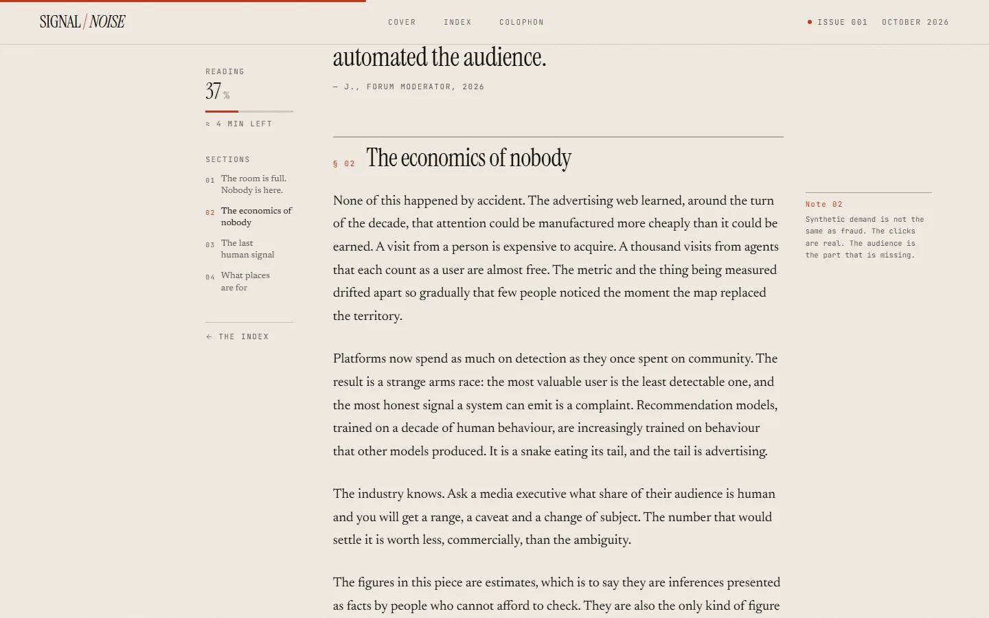
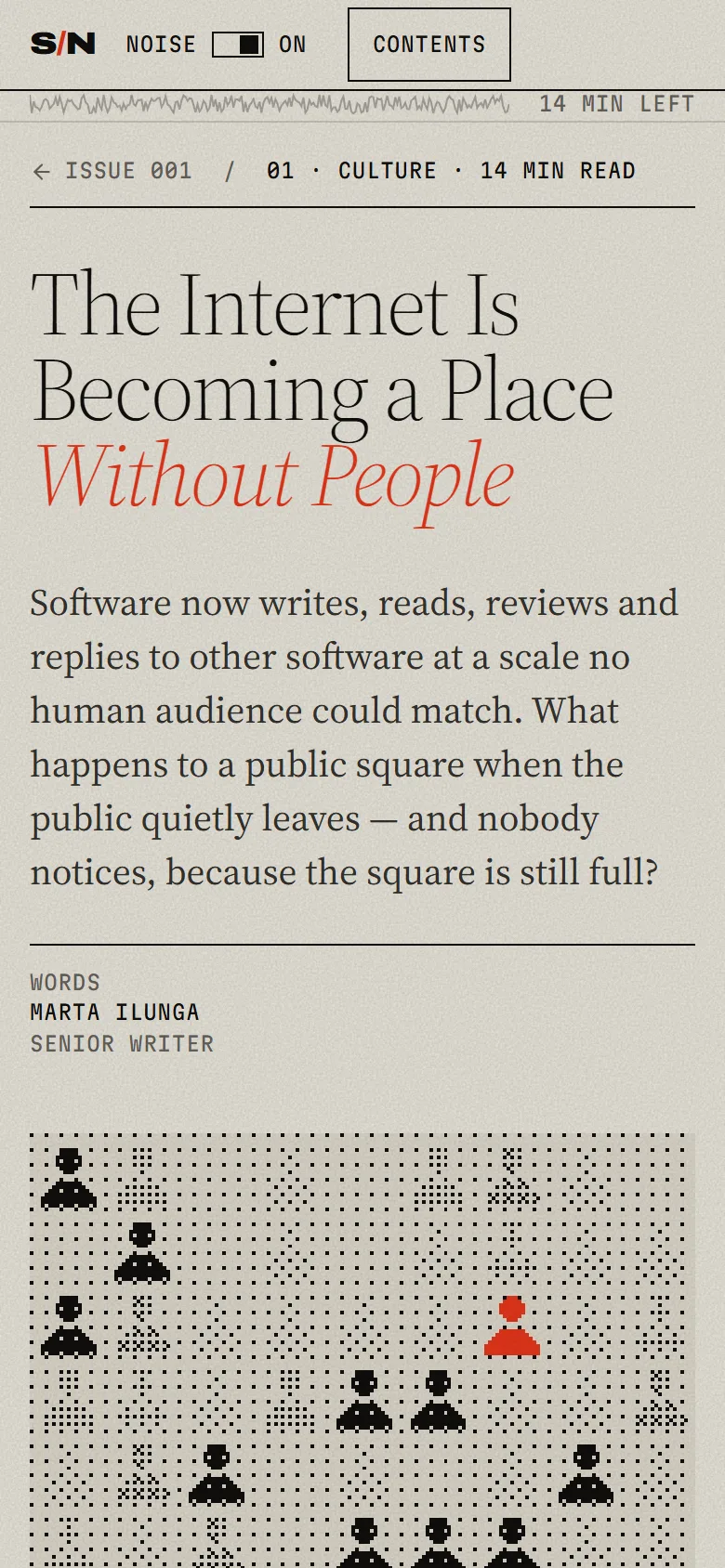
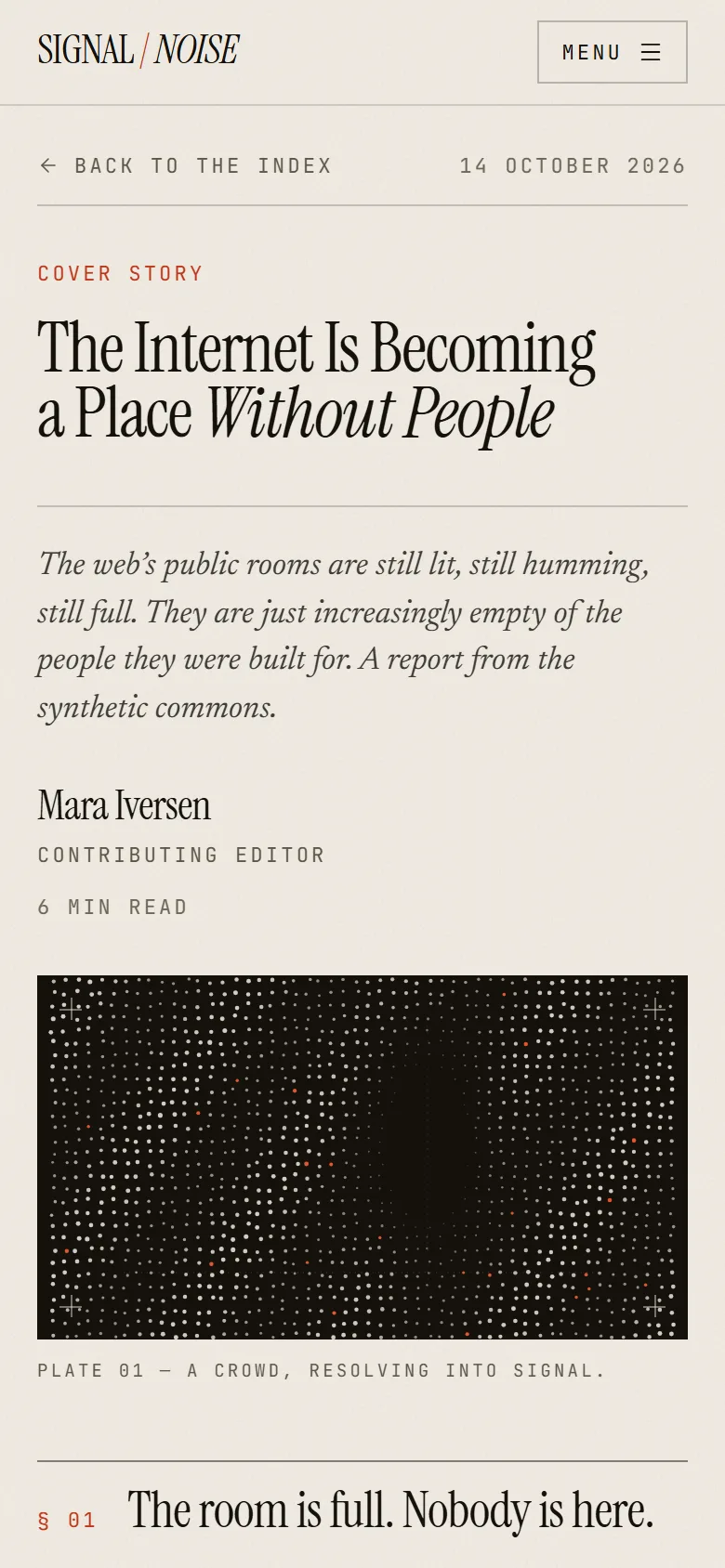
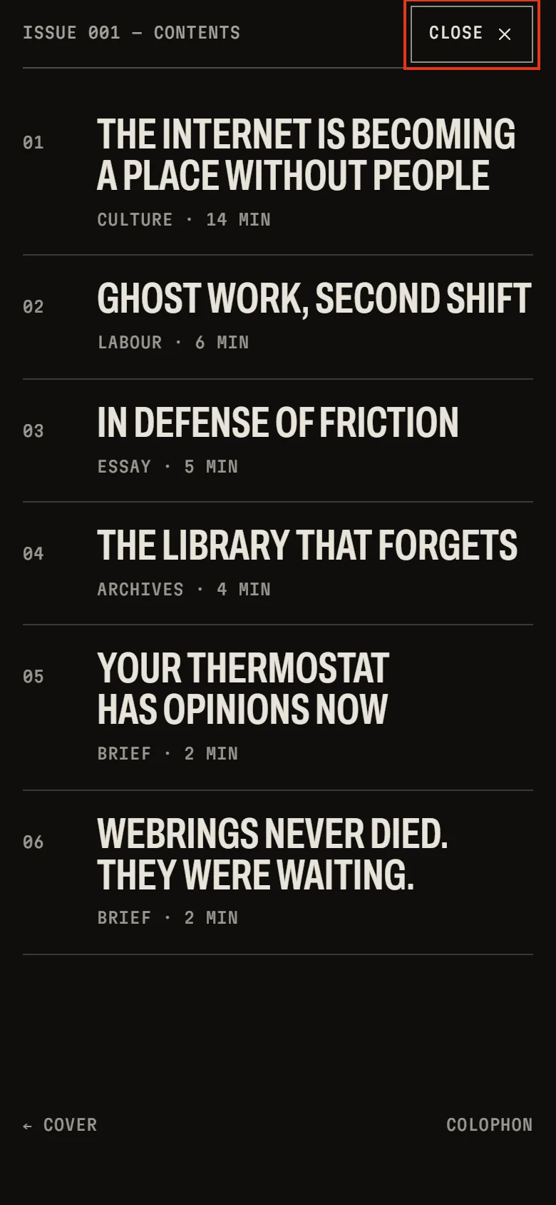
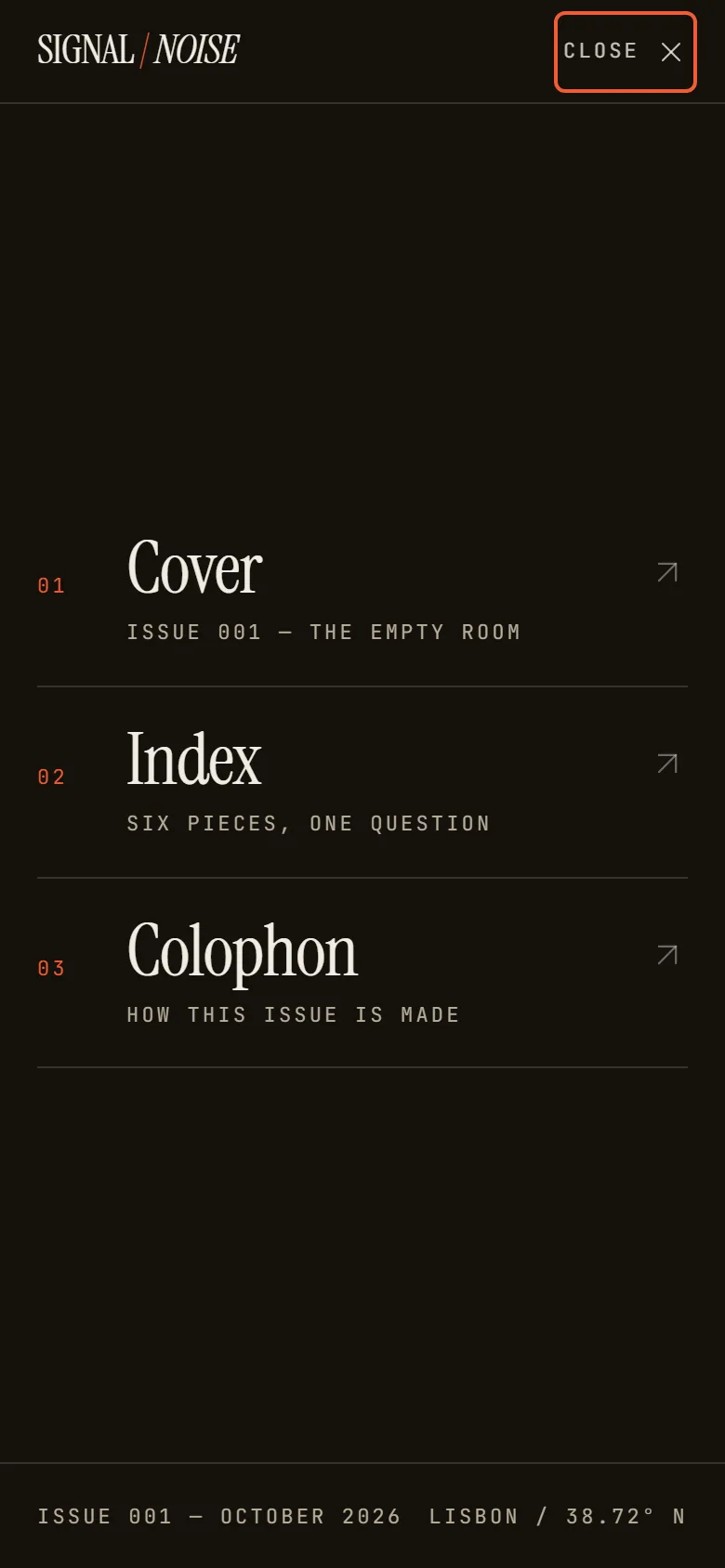
// Live
For motion and interaction. With sync on, both move together.
With a keyboard, Tab into a frame to use it.
// A critique
Both reached similar ideas on their own: a tunable signal, generative plates, one red, margin notes. Opus is louder and more systematic. DeepSeek is quieter and better finished.
| Criterion | Claude Opus 5.5 | DeepSeek V4.1 Flash 1017 | Why |
|---|---|---|---|
| Identityweight 20 | 9.0 | 9.0 | Opus has the more memorable mark, DeepSeek the more refined one. |
| First screenweight 15 | 7.0 | 9.0 | DeepSeek shows masthead and lead story at once. In Opus the lead headline falls below the fold. |
| Indexweight 15 | 9.0 | 7.5 | Opus gives each story its own form under a dial. DeepSeek repeats the cover story and turns half the issue into a list. |
| Readingweight 20 | 9.0 | 8.5 | Both read well. Opus has the longer piece, with a chart and an interactive figure. DeepSeek shows progress twice. |
| Phoneweight 15 | 7.5 | 8.5 | DeepSeek’s phone cover feels designed for the size. Opus’s masthead turns into a dense block of static. |
| Technical finishweight 10 | 8.0 | 9.0 | Both pass every check. DeepSeek self-hosts its fonts and adds a colophon and a 404; Opus depends on Google Fonts. |
| Processweight 5 | 8.0 | 7.0 | Opus used a quarter of the tokens and under half the time, but needed an extra instruction to restore motion. |
| Total | 83.3 | 85.0 |
BestOne idea carried through everything: the issue as a radio band.
Fix firstGive the lead story the first screen and self-host the fonts.
BestThe best first screen and the most self-contained build.
Fix firstMore variety in the index and a router that works under any path.
Critique by Claude Opus 5.5 · 2026-10-19
// The brief
Diseña y desarrolla una publicación digital experimental llamada SIGNAL / NOISE.
Es una revista independiente sobre tecnología, inteligencia artificial, cultura digital y el futuro de internet.
Queremos una web que pueda competir visualmente con los mejores proyectos de diseño editorial digital. Una experiencia con personalidad, no otra landing genérica de SaaS.
Tienes libertad creativa para decidir la dirección de arte, tipografía, composición, paleta cromática, animaciones y sistema visual.
No quiero que me expliques cómo diseñarías la web. Quiero que la construyas.
La web tendrá cuatro componentes principales:
1. Portada editorial
Una primera pantalla que establezca inmediatamente la identidad de la publicación.
Debe incluir el nombre SIGNAL / NOISE, el número de edición (ISSUE 001), una pieza editorial protagonista y una composición visual que resulte memorable.
2. Índice de artículos
Una selección de seis artículos ficticios, pero verosímiles, sobre tecnología y cultura digital.
No uses seis tarjetas idénticas. Diseña una composición editorial que permita distinguir historias protagonistas, artículos secundarios y contenidos breves.
3. Experiencia de lectura
Desarrolla al menos un artículo completo, al que se pueda acceder desde la portada.
Título del artículo: “The Internet Is Becoming a Place Without People”.
Incluye una entradilla, varios apartados, citas destacadas y algún recurso visual integrado en el contenido.
Debe ser una experiencia de lectura agradable y cuidada.
4. Navegación e interacciones
Implementa navegación funcional, transiciones, estados hover, indicadores visuales y pequeños detalles de interacción.
Las animaciones deben aportar algo a la experiencia, no ser decoración gratuita.
prefers-reduced-motion.Buscamos:
Evita:
No tienes que seguir ninguna referencia visual concreta.
Decide tú qué significa SIGNAL / NOISE como identidad editorial y cómo debe expresarse visualmente.
Puedes ser experimental, minimalista, brutalista, sofisticado o adoptar una dirección completamente diferente.
Lo importante es que tus decisiones tengan sentido como conjunto.
Construye el proyecto completo.
Al finalizar, asegúrate de que funciona y proporciona una breve explicación (máximo 200 palabras) de las decisiones principales de dirección artística.
No me hagas preguntas ni solicites aprobación de la dirección visual. Toma las decisiones y ejecuta.
// The measurements
| Measure | Claude Opus 5.5 | DeepSeek V4.1 Flash 1017 |
|---|---|---|
| Weightthe single HTML file, then gzipped | 489 KB / 154 KB | 851 KB / 470 KB |
| Third-party requestshosts contacted while loading | fonts.googleapis.com, fonts.gstatic.com | None |
| Console errorsacross every capture | 0 | 0 |
| Horizontal overflowcover and feature at 390, 768, 1024, 1440 | None at any width | None at any width |
| With reduced motion onlooping animations and moving canvases left | Everything stops | Everything stops |
| axe-core, WCAG 2 A and AAcover and feature, desktop and phone | No rule violated | No rule violated |
| Tokensas declared for the run | ≈ 195,000 · approximate | 770,000 |
| Timewall clock, as declared | ≈ 17 min · approximate | 40 min |
| Stackas declared by the model | React 19, TypeScript, Tailwind CSS 4, Motion, Vite | React 19, TypeScript, Tailwind CSS 4, Vite 7, React Router 7 |
| Captureddate and browser | 2026-10-19 · Chrome/155.0.8059.80 | 2026-10-19 · Chrome/155.0.8059.80 |
// cookies
We only use strictly necessary cookies to run the site. No analytics, no advertising, ever — see our Cookie Policy.
// preferences